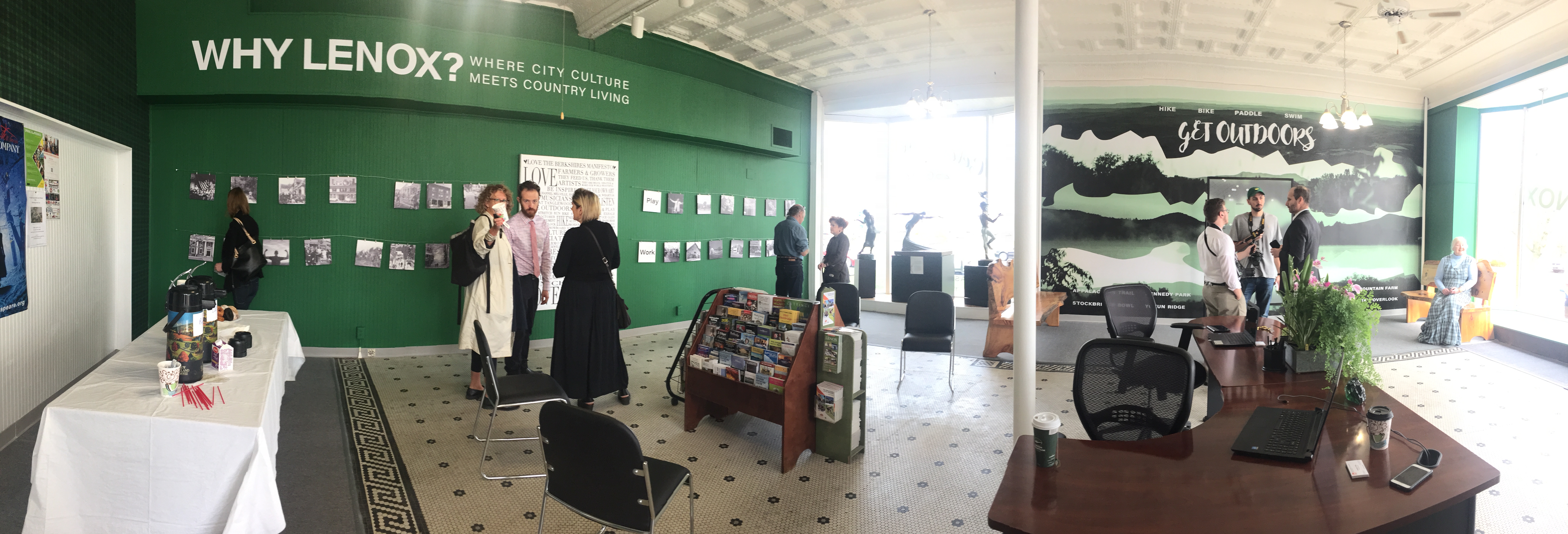
In this post, WP designer Victoria Fiorini offers an inside view of a project that sparked both creativity and community camaraderie: the design of the first-ever Lenox Visitors Center in Lenox, Mass., in the Berkshires.
This has been one of the most fun projects I’ve gotten to be a part in my entire career as a designer/art director. I knew from the beginning, it was going to be fun working with the team at Visit Lenox, and that our hopes and dreams for the space were concurrent.
We knew the installations needed to cater to a younger demographic and also that once we installed something we didn’t want it to look dated in two years. We knew it had to reflect the ‘Why Lenox’ campaign in town and its three main components of “live” “work” and “play.”
Personally, I knew I wanted to have some interactive components to what was on display. If people are going to take the time to come in, I felt it was important to engage them and offer them an experience that was interesting and informational.

It’s so rewarding to see photos I’ve taken over the years serving as educational content at Visit Lenox!
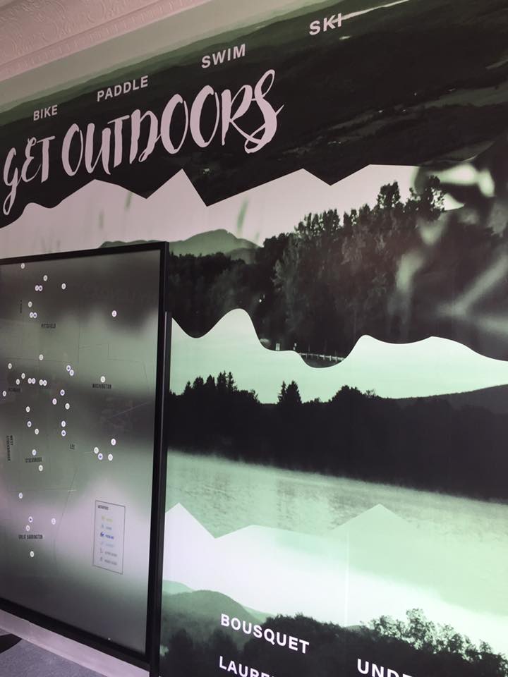
These are the results of these early ideas: the “play,” or outdoor wall, consists of original photographs of various mountain vistas throughout the county. They are arranged in a collage type format separated by undulating lines that also suggest mountain ranges. Sitting in front of this wall is a large opaque plexiglass board with a map of Lenox and its surrounding towns.
In the beginning, we thought that we would just highlight summer activities — but Lenox and the Berkshires are a “place for all seasons,” and the plexiglass gives them a surface to include movable icons that represent a myriad of outdoor activities that can be enjoyed year-round.

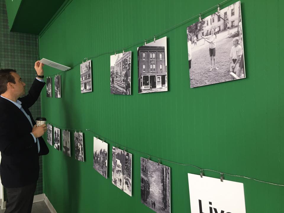
On the flip: Paragraphs helped explain photos of various cultural destinations in Lenox, which people can peruse at their leisure.
The “live” wall is a collection of new and historic photos highlighting all aspects of living, working and playing in Lenox. Walking up to this back wall, visitors are encouraged to flip each image over to get bite sized snippets about Lenox’s main attractions.
There are so many cultural institutions in greater Lenox, but the most recognizable one is surely Tanglewood. One of the coolest things about going to Tanglewood is being able to bring a picnic and sit on the lawn and enjoy you’re evening with friends and family while listening to world class music.
So, this “cultural” wall is a forest green, tartan plaid picnic blanket was one of the first design elements that i knew needed to be included.
The final component that we felt was crucial to having a successful space was what we put on the windows to draw people in. It was clear that in transitioning from the Lenox Chamber of Commerce to The Lenox Visitor’s Center we needed to make it explicitly clear why visitors should come in and what kinds of information they could collect inside.
With my brilliant direction of “you know those shirts that say ‘this & this & this & this’ in a running list,” WP Designer Eden created three perfect window compositions that give you a quick overview of the Center’s purpose.
To see more, visit the center on Housatonic Street in Lenox Village, and feel free to stay and interact as long as you please.

