The latest in a series of inspiration, exploration, and discovery from the Creatives at Winstanley Partners.
AARON FREAKING DRAPLIN. Talk about dreams coming true.
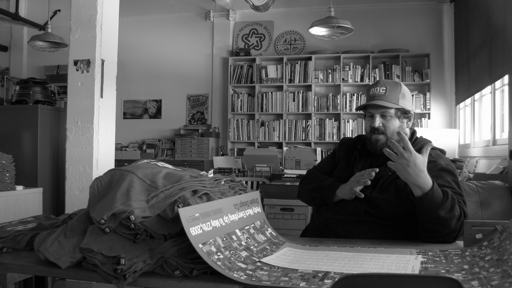
I recently had the privilege of driving up to SUNY Adirondack to listen to the one and only Aaron James Draplin talk about his new book, Pretty Much Everything, and his design process. I’ve been a fan of Draplin’s for years – even if you’re not familiar with him though, you’ve probably seen his work.
He designed logos for President Barack Obama’s administration, for one. He’s behind those funky-and-super-useful Field Notes notebooks, and has even designed gift cards for Target.
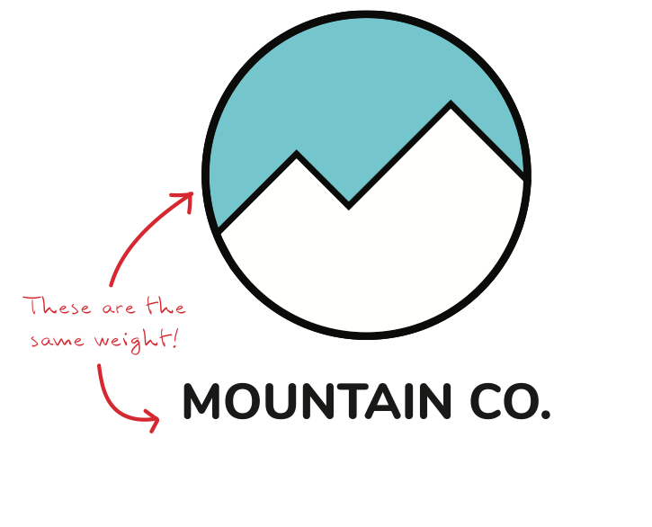
The breadth of Draplin’s work is amazing, but one thing that stands out is the attention to detail and the consistent quality of his illustration work. Thick lines are his trademark, and you can see this in much of his work. A tip he likes that I also learned in design school – and I feel bears repeating – is to consider making some parts of a logo balanced, with part of the icon matching the weight of the typography.
Take the example below (not a real logo, just a quick demo I made). The exterior circle of the icon is the same weight (thickness) as the typography. This is both visually pleasing, and creates balance within the design.

Back to Draplin’s talk, though…It was funny. It was creative. It was inspirational.
And of course it was also informative. Here are just a few of my favorite takeaways:
- The small jobs are where you have fun, but you have to “get ahead of making the bills in order to get to making the shit you want,” says Draplin. In other words, you need to take those big, boring jobs.
- You have to have a list. Write things down, draw your ideas, and put things down on paper!
- The F-word in this biz is FUNCTIONAL: Accessible by design, for design.
- Take one idea and make a million versions! And SAVE each version!
Are you a Draplin fan? Leave your thoughts in the comments!
 This post was written by Eden Loeffel, a graphic designer and Sass Master with Winstanley Partners.

